
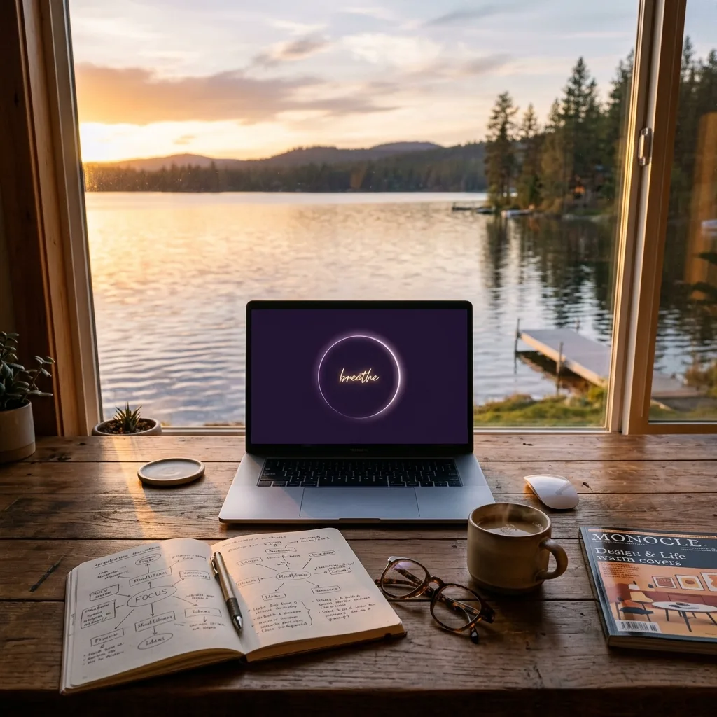
Looking back on the journey of these past few months, it feels as though I have been living through a long, warm dream. I began as a 49-year-old single mother, standing before the great wave of AI, feeling suffocated and not knowing what to do with myself. Today, I have been able to bring my own calming web app, WOLKENWEICH — the Cloud-Soft System, online with my own hands. Every step between then and now has been filled with technical places where I became stuck, and with the inner work of learning, enduring, and growing. This Build in Public journey has been full of stumbles. Yet I have finally come to understand that some forms of joy and redemption do not come from the cold outcome of commercial monetization. They come from this: “I am finally walking a road that leads me toward myself, and I have taken back the light that belongs to me.”
1. The Road Back to Myself: The Real Trace of Building in Public
When I first began trying to find my way into AI and website building, I often felt inadequate when I looked at other people’s success stories. The internet was full of experts displaying sophisticated code and automated workflows, while I could remain stuck for three days over something as basic as domain resolution. But I chose to face my own vulnerability honestly. I wrote truthfully on my blog and social platforms about every error message, and every struggle that came with a failed attempt to obtain an SSL certificate. This is the core spirit of Build in Public: not presenting oneself as an expert who knows everything, but standing as a genuine explorer and honestly sharing the signposts one has passed and the pitfalls one has encountered along the way.
Unexpectedly, this honesty brought me many warm echoes. Women close to my age, who also felt anxious in this technological age, left messages to encourage me. Some even told me that my record of this journey had given them the courage to begin again. This made me believe even more firmly that Tech Zen is not merely a set of tools or code. It is a gentle system for living. Technology should not make us more hurried. It should make us more free. With a little less anxiety, space appears. Once space appears, breathing returns. We build these digital assets with our own hands so that we may help ourselves and others preserve more of life’s preciousness in this hurried world.
2. The Tedious Fine-Tuning Before Going Live: Mobile-Side Obstacles in Responsive Layout
In the days before WOLKENWEICH was due to go live, I faced the most painstaking test before release: carrying out the AI Calm Web App Pre-Launch Security and Performance Checklist. I had assumed that all of its features had already been developed. I had thought that all the features were already complete, but during cross-device testing, I once again ran into technical issues that proved particularly troublesome.
Across mobile browsers from different brands, the website’s CSS layout developed serious Overflow issues. The glowing breathing circle, which had sat elegantly centered on desktop, was forcibly compressed and distorted on certain narrow mobile screens. In some cases, it even created unsightly horizontal scrollbars. In addition, the website’s font size appeared excessively large on mobile devices, obscuring the central “breathe” text. What troubled me most was the loading experience on mobile. Because the image files were too large and the scripts were loaded in an unsuitable order, the page displayed a blank loading screen for as long as 5 seconds. For a web app designed around stillness and relaxation, this was undoubtedly a fatal flaw in the user experience. As I looked at the displaced and lagging circle on my phone screen, I once again felt the anxiety and exhaustion that came in the days before WOLKENWEICH went live.
3. The Intervention of an AI Mentor: CSS Overflow Diagnostic Review and Responsive Refactoring
Facing the final technical hurdle before WOLKENWEICH went live, I did not choose to give up. Instead, I turned once again to my AI mentor. Like a meticulous quality-assurance engineer, it guided me step by step through a diagnostic review of my CSS code and a responsive-layout refactor. It taught me how to use the most elegant styling rules to bring those unruly mobile layouts back under control.
With the guidance of an AI mentor, I made the following refinements. First, I added `box-sizing: border-box;` and `max-width: 100%;` to the CSS, then applied `overflow-x: hidden;` globally to the html and body elements. This completely removed the unsightly horizontal scrolling on mobile devices. Next, I used CSS media queries to fine-tune font sizes across different screen widths. With the `clamp()` function, the type scales fluidly with the viewport, ensuring that the breathing text remains perfectly centred and never becomes obscured on any device. Finally, I improved the loading behaviour of the WebP images by setting `loading="lazy"` and removed nonessential render-blocking JavaScript. This reduced the mobile page’s First Contentful Paint (FCP) to just 0.8 seconds. When I saw the page unfold on my phone with the fluidity and quiet elegance of a cloud, I knew we had finally made it work.
4. A Hands-On Step-by-Step Guide: Pre-Go-Live Responsive and Performance Checks for Your Website
If you are also preparing to deploy your own web project and bring it online, I recommend that you make sure to carry out the following three responsive-design and performance-checking steps before it goes live:
- Step 1: Configure Global `box-sizing` and Overflow-Prevention Settings:At the very top of your CSS stylesheet, use the universal selector to set `box-sizing` to `border-box` for every element. This ensures that padding and borders do not unexpectedly add to an element’s width. At the same time, set `overflow-x: hidden;` on the `body` element. This creates a protective boundary that prevents horizontal scrolling and the resulting layout breaks on mobile devices.
- Step 2: Use the CSS `clamp()` Function to Create Smoothly Responsive Text:Avoid using fixed `px` font sizes on mobile devices. Use syntax such as `font-size: clamp(1rem, 4vw, 2.5rem);` to allow text size to transition smoothly between its defined minimum and maximum values as the screen width changes. This ensures that your headings look spacious and visually striking on desktop, while remaining refined and well-proportioned on mobile devices.
- Step 3: Implement Image Lazy Loading and Reinforce Website Performance:Manually added the `loading="lazy"` attribute to every image tag below the fold, then compressed and converted all images to the high-performance WebP format with local tools before publishing. This substantially reduces server bandwidth consumption while giving visitors an exceptionally smooth, near-instant loading experience.
5. Running Toward the Road to My Dreams, Becoming the Person I Want to Be
Leaving space is a way of holding life with ease. Gentleness is not giving way. It is a deeper kind of strength. Today, WOLKENWEICH — the Cloud-Soft System has officially gone live. As I look back on the dream path I have travelled, I feel an immeasurable sense of peace and fullness. At last, I am no longer being led by the nose by the great wave of technology. With my own hands, I created a world I am willing to remain in. And in the process, I have taken back the light that was once belonged to me.
Over this period, I have shaped this calming system into a practical MVP product "AI Calm Web App Starter Kit" It is available in the following editions for you to explore and choose from. More than a set of tools, it is a starting point for us to reclaim the rhythm of our lives, together:
Visit our online store to explore the full details. Let us learn how to breathe again inside a calmer digital space.
🛍 About Our Digital Store:Payhip is my small online store for WOLKENWEICH digital products, including the AI Calm Web App Starter Kit . If you are looking for practical tools that can help you create more space, clarity, and rhythm in daily life, you are welcome to visit the MissLiaSay Payhip Store .
⚙️ About My Automation Home:Make.com is the platform I chose to connect my digital assets and marketing funnels. Its visual interface helped me move beyond the confusion I once felt in front of complicated systems. It became a stable and suitable home for the automation work I have been building.
☁️ Extend the Immersive ExperienceIf you would like to experience a fuller atmosphere of Tech Zen through sight and sound, or see how I use automation systems to run my independent media work, you are welcome to subscribe to my YouTube channel:MissLiaSay. Let us rediscover the softness and rhythm within ourselves, together, in this noisy digital world.